I recently had the opportunity to attend a “color trend forecast” by a leading paint manufacturer. The company provided “color” into the ever-changing window of design. Paint, more easily than any design element, has an amazing ability to transform a space. For a minimal monetary investment you can change the entire look and feel of a room in as little as a day. It can make a drab room feel bright again or a cavernous one feel cozy. You’d be surprised how it can even give a tired sofa a new life by surrounding it with vibrant color and energy.
The latest color forecast for 2015 was described as “cautiously optimistic.” This may sound strange when you are talking about color, but just as color has an amazing ability to influence our moods, the mood and climate of society has the ability to influence color trends.
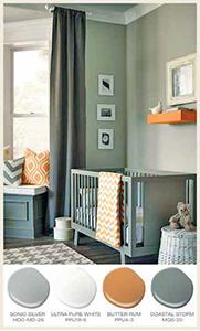
How can paint be cautiously optimistic? There are moody hues. They are deeper and grayer shades of blue, dark ruby reds, dark teals, and many shades of gray with varying tones…from purples to golds. Cloudy colors are muted with added white and chalky colors leave an almost powdery looking finish that is perfect for shabby chic accent pieces. These can be paired with translucent colors like metallic, pearlized or contrasting hues for a sophisticated and finished look.
Another big trend continuing into the next year is luminous and iridescent colors and finishes– those shiny jewel tones that look like they just dropped in from another galaxy. These can be used in small doses as painted accent pieces, accessories, gilded frames, and moldings.
There are paints that offer leather and suede finishes, metallic distressed finishes in pewter and bronze, stone and marble finishes, paints that can make your walls look as if they are lined with linens, and glazes that can match the indigo shades on your favorite old pair of jeans. You can do almost anything with a can of paint and the proper tools.
The 2014 color of the year is Radiant Orchid. It is described as “emanating great joy, love, and health.” That seems like a lot to expect from color! Radiant Orchid (aka purple) has evolved since it began in little girls’ bedrooms. We have seen it emerge in fashion, in our homes, and in our landscapes. It has morphed from a fuschia purpley-pink to plums, violets, maroons, and mauves in all their permutations. Purple has matured as has our taste in color. Gone are the days of painting the boy’s room blue, the girl’s room pink, and the living room a shade of white.
Your home should and can reflect colors that give each room the sense of being connected to the others by using color on the walls to transition between the rooms. If you stand in the center of a circle and have all of the rooms in your home surround you, there should be an overall tone or feel that carries throughout to give your home its special feeling. If you are painting only a room or two, keep those transitions in mind as you select your colors. How does the color look next to the hallway? How does it look from the next room?
If you prefer light, bright tones, deep jewel tones, faux finishes that can make your walls look like marble or leather, almost any texture…your color scheme can be successful if you remember that color has the wonderful ability to impact our moods and change our outlooks, and they should somehow complement each other.
So when you’re ready to spend your time with the rollers and the paint brushes, check out the swatches and finishes at your favorite paint suppliers, spread paint chips out in front of you, coordinate your palette, and dare to leave off-white and ecru behind.
By Shoshana Halpert