

Whether people notice it or not, everyone has fallen victim to the overwhelming presence of Millennial Pink. That’s right, a shade of pink is named after an entire generation. It represents the versatility of color between genders, a point many fashionistas have observed on their own, as pink and purple are no longer “girls colors.” While it may have started as an accent on a striped shirt, or even a fully pink tie, it is now the accepted norm for men to wear completely pink shirts, and no color represents this shift better better than this specific shade of pink. Similar to Pantone’s color of 2016, Rose Quartz, a shade of pink similar to ballet slippers (and Ballet Slipper is the name of another of Pantone’s light pinks, almost indistinguishable from the others), Millennial Pink has been so ubiquitous that the name is recognized over Pantone’s Rose Quartz, though they are quite similar. Of course, all of those names sound more appealing than “salmon pink,” another name people have used to identify the color.
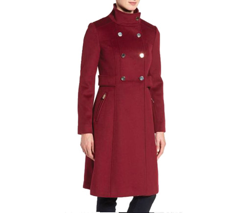
While this pink was popular throughout spring and summer, recent colors have been leaning toward warmer tones, with reds stepping out to overshadow their pink cousins. So is the Millennial Pink trend over? “Millennials needed the softness and calmness that the pink provided, but the shade fell flat after a while,” explained interior designer Shoshana Halpert, of Shoshana Halpert Designs. “People have been starved for warmth and are returning to the reds and other warmer tones.” Whether they’re called marsala, burgundy, crimson or a Crayola favorite, burnt sienna, warm reds add richer, earthy tones.
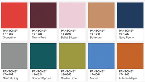
Pantone releases color palettes each season. Known as the Fashion Color Report, they collect the shades from Fashion Week Runways and highlight the top 10 shades, complete with suggested pairings. While Ballet Slipper pink is on the list, two distinct reds are there as well. Grenadine, a bright red Pantone described as “dynamic and energetic…a confident and self-assured attention-getter,” as well as the deep, rich red of Tawny Port, “elegant, sophisticated and tasteful,” blend the pinks and reds together for this season.
For those who are fashion conscious and prefer to look current in their colors and trends, Halpert offered suggestions for warming up the cool, calm tones of pink, and stay au courant with the season.
Halpert references home design, and the constantly changing trends there as well. Many trends are cyclical in interior design and knowing how to work current styles with previous looks is part of making a successful, fluid environment of color.
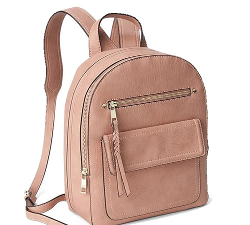
If someone jumped on the Millennial Pink bandwagon earlier in the year, rest assured that it will blend with the current warm reds. Halpert suggests accenting light pink clothing with accessories. A purse, a scarf or shoes with these colors can bring warmth to any wardrobe.
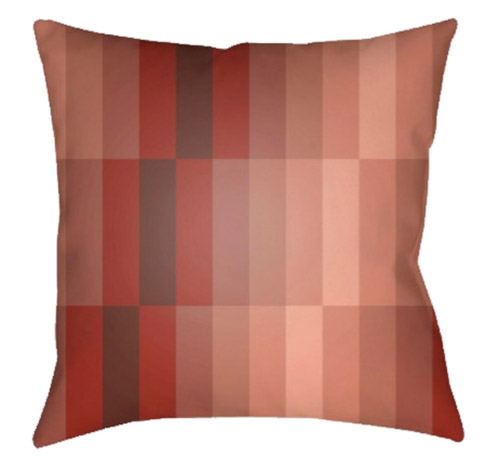
If someone has an excess of pink furniture, or even has neutral shades but would like to add fall tones, accent pillows or throws make an excellent addition to living room decor.
Halpert reminded readers that metallics have been popular, and bronze or gold accessories can also bring a warm tone to the cool pink.
Of course, people should wear a color because it makes them feel good, and not solely to cater to the capricious nature of the fashion gods. If you like Millennial Pink, salmon pink, Rose Quartz, Ballet Slipper or any shade with a whimsical name, wear it, decorate with it and own it. Instead of using reds to downplay the pink, bring light pink into your wardrobe to bring out the color you love.
This fall, reds and warm tones take the stage, but blend with the cool tones of last season’s pinks. With Halpert’s suggestions and tips to allow the two seemingly opposing colors to work together, along with color tips from the Pantone Institute, whatever the weather forecast may say, the colors will allow you to stay warm.
By Jenny Gans


