

For many, moving into a new home is overwhelming. There are decisions to be made and much to do to get you and your family settled. Oftentimes, in an effort to make that happen quickly, homeowners overlook the importance of color and go for the quick fix of painting everything neutral.
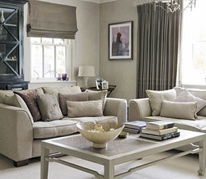
When used in a thoughtful way, neutral is beautiful and timeless. But if every space on your main floor is painted in the same neutral then you end up with bland and boring. So if you want to stay neutral, how do you make it work? Neutral can be warm and earthly or cool and modern. It’s all in the tone of the color which is chosen. A key factor in making a neutral work is to vary it throughout the house. Maybe go a little brighter in the kitchen or darker in a den or library to make it cozier. Even though your paint is neutral, and may even be light enough to be labeled white, having a slight variation in the color and finish of the trim will also add dimension and make the space more beautiful and interesting.
When it comes to color, the new neutral is gray, or, more accurately, greige. Greige is a color that did not even exist a few years ago, and I doubt you’ll find it in your child’s crayon box any time soon, but if you ask for it in a paint store they’ll be sure to know what you are talking about. Greige is really an outgrowth of taupe and not all that different. They are both primarily combinations of gray and beige and then have small amounts of other colors mixed in to give them variations of depth. While gray is very popular and trendy today, remember to add a little warmth to your color to give you more flexibility and longevity in the overall color scheme and design of your home.
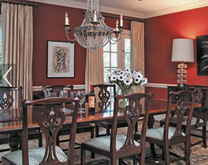
Now, some of you are asking, what about real color? Reds, blues, greens and purples? Yes, they all still have their place. Design, and color specifically, is very personal. While many people love the flexibility of neutrals, others feel more at home surrounded by color. While some colors may be trending, no color can ever really go out of style. Greens and blues are always popular in living areas, especially those connected to an outdoor space so they can pull in the colors of nature. Soft greens or blues work well in large, open-floor plans, and if you want even more color you can pick an accent color for pillows or a rug that can then be brought in as the main color in a new room such as the dining room.
Yellows and reds have always been popular in dining rooms because of their richness. If you want to commit and really envelop the space you can paint the whole room the rich color. If you want to keep it a little toned down, you can divide the room with a chair rail and use the more intense color on one section of the wall or on an accent wall. You can then pick up on the blue or green from the living room and tie it in by placing it on an accent fabric, accessory or trim on the window treatments—in a dose small enough so the room does not become busy with color, but just a hint to remind you of what is going on in the rooms beyond.
It is important to remember that color can have a profound affect on our emotions; so when selecting colors, think about who will use the space and for what purpose. Sample paints before painting the entire room and make sure to see the sample at different times of day and different variations of light. A color that you like on a rainy day may be too bright on a sunny one. Stand in the entrance to your room and see all the rooms that connect from one to the next. Keep in mind what rooms you can see into and make sure your colors and tones connect. Whether you like a traditional colorful room or take the approach of a more modern, neutral one, use color to create the home you desire.
By Shoshana Halpert


