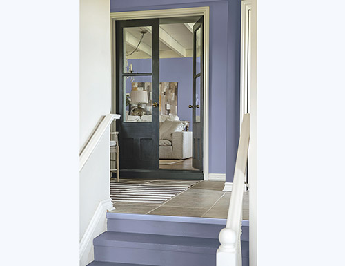
(BPT) – You see it every year – a “hot” new color begins appearing on phone cases, walls, ceilings, furnishings and accessories. Soon, virtually everyone who’s doing any kind of renovation or design work is incorporating that color into their project. Have you ever wondered how home color trends happen?
“Our team of global color experts assess societal and cultural influences from around the world to forecast what colors will be popular in home decor, consumer goods, automotive and even on airplanes for the upcoming year,” says Dee Schlotter, senior color marketing manager for PPG in North America. “We also look at what major retailers are doing in home décor, and what’s happening in society, and people’s state of emotion because of these events. All this information helps us predict what colors will resonate with people in the coming year.”
For example, immediately following 9/11, pinks and browns were popular because people craved comfort and security. For 2017, a blending of various cultural norms influenced the choice of purples as color of the year, Schlotter says.
“Culturally, we’re seeing a shift toward blending of gender, relationships, careers, workplaces and living spaces,” she says. “For example, male makeup models are now blending traditional views of masculine and feminine. Hotels, restaurants and homes are blending indoor and outdoor spaces, and modern offices are finding middle ground between work and play. Purple is such a blended color that it really speaks to what’s going on in the world, especially for our choices of 2017 color of the year, which combines gray, blue and purple all in one tone.”
Shades of purple are the colors of the year for multiple paint brands including PPG Paints, Glidden and Olympic paints. Glidden’s Byzantine Blue and PPG’s Violet Verbena blend blue and gray to create a hue that appears more gray when paired with dark neutrals and bluish-purple when paired with whites, similar to that of a chameleon. Cloudberry from Olympic is a calm, soft violet that also straddles the blurred line between purple and gray.
“Blended purples evoke a lush, pampering yet calm effect that’s a comforting foil to the harshness of the world right now,” Schlotter says. “These trending colors are sweet without being feminine, and gray without being somber.”
The colors also mesh with the more bohemian lifestyles people seem to be pursuing, she notes. A trend toward spiritual exploration is driving interest in meditation and yoga, which blend elements of mental and physical exercise. “This fits perfectly with the purple trend because this hue is thought to represent the subconscious, and can be a meditative color in the right tone,” she says.
While Schlotter says homeowners have historically been shy about using purple, this year’s hues will work well in a variety of settings. The muted nature of the colors makes them gender-neutral yet impactful, so they’re great statement colors when used in a dining room, on the front door or even as an accent wall in a child’s room.
What’s more, the color pairs well with trending home materials, such as gray flooring, black tiles and gold décor accents. The unique blended qualities of the colors mean these purples can adapt to the surrounding environments and blend effortlessly.
“The great thing about Violet Verbena, Cloudberry and Byzantine Blue is that they all have hints of other colors and neutrals in them,” Schlotter says. “Gray is popular now more than ever, but many consumers don’t want a monochromatic look. These beautiful purple hues pull in hints of blue and gray to form chameleon-like hues that adjust based on their surroundings. They’re not your typical purple, but rather can be looked at – and used – like a new neutral.”


