You know the ad on television, “What’s in your wallet?” In my designing “wallet” I have roughly 1000 colors, and every one of them says something. To someone. Maybe to you.
It says something to me for sure. Because when I get to know someone—I hope this doesn’t sound too strange—I see them in living color. By which I mean that I see a sort of aura around them in the colors that complement their persona.
So, there are “colors of the year.” From Pantone. From Sherwin Williams. From Benjamin Moore. You get the idea. Will those colors work for you? Together we can find out.

Let’s explore this more. The trending color now is in the green family, the idea being that because we are surely worn down by the pandemic, we crave the soothing balm of nature. Even though we couldn’t gather in groups, we could walk in the park or sit in our garden. Soft greens, silvery greens, gray-greens, even olive greens will bring a whisper of nature indoors to bestow calm.
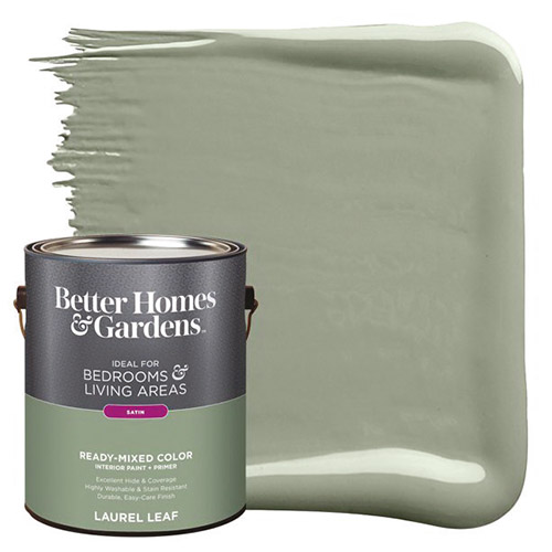
Better Homes and Gardens has created, for the first time ever, a color for the year, and it is called Laurel Leaf—think eucalyptus leaves. It has an organic feel and warm undertones. We could try this in a bedroom to enhance relaxation, or perhaps in a dining room to lend a note of sophistication without being too bold.
Sherwin Williams has chosen Evergreen Fog as its color for 2022. It is a mid-tone gray-green that we could use to provide a welcoming note to an entryway, or we might select this color for the living room, where it would be a subtle wash of color that still makes a statement. It would pair well with earthy neutrals like camel and with textures such as leather or rattan, as well as warm metals like brass.
If you appreciate the properties of the aloe vera plant, its color is echoed in PPG’s color of the year, Olive Sprig. This is a gray-green mid-tone that we could use to enhance focus in a home office or use in a kitchen with lots of white as a balance. Olive Sprig functions as a peppier choice than a plain neutral—it reads as an optimistic color.

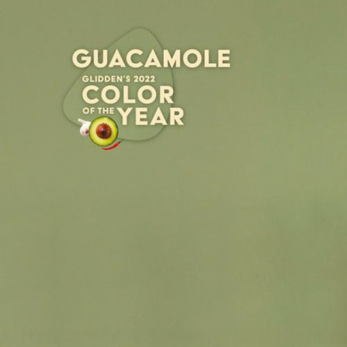
Get ready for this one—Glidden’s pick for color of the year is Guacamole. Yes, it is an avocado shade, but it comes across as very refreshing. This would be so beautiful in a bathroom with white tile and black accents. The company noted that online searches for green have more than doubled since 2020.
Picture a flower stem’s pale, silvery-green and you have Benjamin Moore’s color of the year, October Mist. We could combine the cool undertones of this lovely color with an equally cool blue-green or use a dark shade of green with it to add warmth. This brand’s color palette for 2022 reflects all the hues of nature.
Have you ever strolled along the beach and found a pretty piece of sea glass? This wind-blown shade is Behr’s color for 2022, called Breezeway. A blue-green, it offers the energy of the ocean, and we could use that in a entryway to bring a lively openness to your space. And although it has a coastal vibe, I could also see this color in a vintage setting.
From a blue-green, we transition into nature’s blues. HGTV Home’s color of the year is Aleutian, a washed-out indigo. Since this color has a warm undertone, I think it would be perfect in a bedroom for a restful feeling; we could even extend the color onto the ceiling to create a cocoon effect. For ease of decorating, HGTV has designed a palette around Aleutian called Softened Refuge. Isn’t that a great image for a peaceful setting?
Valspar also created a palette of colors centered around blues and greens, with colors such as Blanched Thyme and Mountain River. Let’s not forget that trim also needs our attention to finish off a room perfectly, and these might be just the right choice for that.
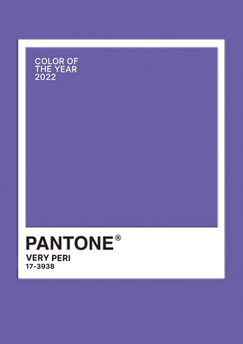
And now—ta da!—is the always-most-awaited color, that chosen by Pantone for color of the year. The company decided to create a new hue for the job, and it is called Very Peri, a blend of blue with red and a violet undertone. This color is meant to bring joy to a space, and it would be wonderful in a child’s room.
As you can see, all the colors reflect a softer, warmer look for homes that have become multi-use centers for our work, play and wellness. They represent balance and stability and foster optimism. I would be pleased to bring these qualities into your home life.
Recently I helped a couple create a spa-like bath for their primary suite. There were many decisions—tiles, accents, fixtures and colors. We chose a variety of aqua tones, from the deep turquoise of the ocean they loved on their last cruise to the Mediterranean to the soft bluey greens of their trips to the shore. I am delighted to share they have told me that each evening they are thrilled all over again at what we accomplished together.
In contrast, I worked with a client who has a beautiful, traditional living room but wanted to change the color of the walls. After walking around the room and sitting with her for a little while, I opened my huge book of colors and selected a warm, beige-y cream. I held it up to the wall, we looked at each other, and in unison said, “Stunning.” It made all the difference.
I would be honored and happy to work with you to make certain that your cherished home reflects your wishes for a calm haven and uplifting space!
Dorene Richman lives in West Orange with her husband, Ron, and their furry family. She can be easily reached at 973-699-1462 or emailed at [email protected].


