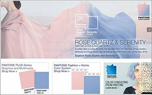


Carlstadt—As 2015 closed, many vowed for a calm and peaceful year at the top of their 2016 resolutions. Pantone, a North Jersey-based company that studies color, chooses a color each year that they feel reflects the mood of society. Deviating from the usual one color, this year Pantone named two colors as the colors of 2016: Rose Quartz, a light pink color, and Serenity, a soft pastel blue. These colors “demonstrate an inherent balance between a warmer embracing rose tone, and the cooler tranquil blue, reflecting connection and wellness, as well as a soothing sense of order and peace,” explained Leatrice Eiseman, executive director of Pantone Color Institute. As its name conveys, Serenity “comforts with a calming effect…even in turbulent times,” while “Rose Quartz conveys compassion and a sense of composure,” Pantone elaborated in a statement. Pantone felt that consumers are looking for “an antidote to the stress of modern day lives,” and hopes these colors—both individually and used together—will provide a calming release.
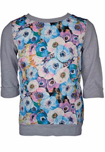
While these colors work well in fashion on their own, many designers have been featuring them as part of prints. According to Pantone, designers such as Emilio Pucci, BCBG, and Richard James all incorporated Serenity and Rose Quartz into their collections, many using the colors in plaids, floral prints, striping and color blocking.
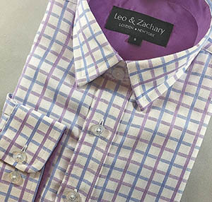
“One might think these colors are gender specific, but take plaids in Rose Quartz and Serenity for a boy’s Shabbos shirt, match with light gray Shabbos pants—so sharp,” explained Dassie Fuchs, owner of Petit Chic, a boutique children’s store. “For girls, a light pink dress with a light blue cardigan and you have the perfect spring outfit.” Fuchs described that for both boys or girls, yellow works well as an accent color or accessory.
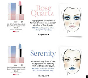
Pink has been a staple color in beauty products since, probably forever, which means Rose Quartz is a natural tone to add to a beauty palette. The addition of Serenity allows makeup artists and their clients to be a little more creative. Pantone partnered with Sephora, a global cosmetic retail store, and has released exclusive beauty products in the Pantone colors of 2016. Sephora allows its customers to stay traditional, with Rose Quartz on lips and cheeks, but also adds an edgy element, with blue lipstick and eyeshadows. “Focusing on expressive eyes, soft pastels in various shades of pinks and blues will lend their tranquility to eyeshadows in modern mattes and sheer shimmers to create wide-eyed, tranquil looks,” said New Jersey native Chana Perel Benzaquen of BZ Cosmetics. “Expect these soft colors to reflect a natural femininity partnered with an exuberant spring impact with stronger pigmentations in cheeks, lips and nail colors,” Benzaquen stated.
The 2016 colors also offer versatility in home design and decor. The colors “bring a feeling of calm and relaxation into the home environment,” and while Pantone purports that they are good choices for rugs and upholstery, they also work well as decorative accessories. Combining the solid colors with patterning in pillows, throws, window treatments and bedding also adds to the aura of calm in the home.
“One of the problems with anything ‘of the year’ is that you never know how long it will remain a la mode,” explained Naomi Mezei, principal designer of North Jersey-based Eclectic Interiors. Mezei also stated that the subtle natures of the pastel shades allow for versatility, without creating a color that will make homeowners cringe in a year, or two, or five. Both Serenity and Rose Quartz “look great as window coverings…complementing many different wood shades, and are on trend while leaving walls a more neutral gray or beige,” continued Mezei. Floral patterns have been popular recently and Mezei expects to see both colors used in this trend too. While some do-it-yourself decorators may feel that the pastel shades of 2016 may be too traditional for their tastes, Mezei corrected any misconceptions on that front. “It’s all in the accessories and wall art you pair with it,” she claimed. For any style decor, whether traditional or modern, “the warmth of Rose Quartz and soothing nature of Serenity are perfect for bedrooms.”
Pop culture fans should note: If this year’s colors are too calming and relaxing, Pantone also released the bright and cheery Minion Yellow last spring. As Eiseman states, Minion Yellow is “the color of hope, joy and optimism.”
Whatever color someone may seek, Pantone is sure to have the shade to reflect their mood and allow their customers to go into 2016 with a calm and serene approach.
By Jenny Gans


