
As I look back over the past 10 years worth of issues, so many memories come to the fore. Each and every edition represents a literal snapshot of our community’s life and history over the past decade.
My editors and I often like to say that The Jewish Link is a primary source of Jewish history, as it captures so much of what is going on in our community as we are living it (or a week later, but it’s close enough) and it’s for that reason that we proudly send our weekly edition to the Library of Congress and other libraries throughout the U.S. that ask for our paper.
In this piece, I would like to take our readers a bit behind the scenes and explain a few things about The Jewish Link that they may not be aware of about our front page and the logos we have used over the years.

When we started The Jewish Link, I had a couple of priorities. First, I knew that I wanted our paper to look like what I thought of back then as a “real” newspaper such as the Wall Street Journal or the New York Times. And what those papers have in common is that they both start multiple articles on their cover pages. My strong feeling at the time was that I wanted The Jewish Link to “channel,” in a sense, the fact that we were like these other papers and that our readers would see us as a real paper, so to speak. You can agree or disagree with what I thought at the time, but that’s what I felt strongly about and that’s why I chose for our first issue to have five articles starting on the cover.
Another reason for starting so many articles on the cover is that I also wanted to make sure that our writers would get a thrill out of seeing their byline on the cover. Moreover, I also wanted our readers to start reading the first paragraph or two of the article on the cover and get immediately hooked by the first few sentences. Once hooked and having started the story, I was sure that they would want to then open the paper and read and explore itr further, in addition to finishing the cover articles. And of course, they would then see everything else our paper had to offer. I like to believe this formula worked then and still works today.
And very importantly. I also wanted to make sure that our paper did not resemble or look like any of our competitor papers. At the time, and even today, most of our competitor/peer publications do not start multiple articles on the cover and usually just choose a striking or great image or picture, usually associated with the main or lead article, to dominate the cover. This “magazine” style approach to front page design is great and, in truth, I happen to agree that it is probably more aesthetically pleasing than the current Jewish Link cover, but that’s not the look that I was hoping to achieve. We have deliberately eschewed a magazine-style look even though I know that it would probably look nicer. Talk to me in another 10 years and we will see if I still feel the same.
Regarding the name and the logo of the paper: I believe I have written this before, but some of our readers and my friends know that I never actually loved the name The Jewish Link and I feel that, to most, it sounds like a kiruv organization, not a newspaper or media company. However, when going through all of the other name options, I didn’t feel any were available that I especially loved and since at the beginning I was partnered with the team that started the Queens Jewish Link, starting with the name Jewish Link just made the most sense.
The big lesson for me about the name of our paper is that one should not get too hung up on deciding the name of one’s business. Names are great but even with a name that you don’t love, at the end of the day, it’s really about the product that you are putting into people’s hands and not so much the name. I may never love the name “Jewish Link,” per se, but I have come to love what our paper is and represents.
Below are some snapshots of a few selected logos with some additional info that I hope you will enjoy.
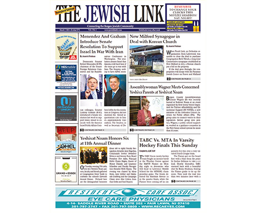
The Jewish Link’s first-ever edition, Mar. 7, 2013. For our logo, I basically decided to try and emulate the look and feel of the Wall Street Journal font. That’s why The Jewish Link masthead font and logo is the way it is. For the cover page itself, notice how much text there is and how many pics, and how small our headlines are. We were trying to put as much as possible on that inaugural cover because I wanted to make sure that people saw that it had something for almost everyone to read.
The Jul. 11, 2013, edition. This is the first edition with Bergen County prominent in the logo, even though the paper was known originally as The Jewish Link of Bergen County. There is still a lot of text on the cover.

The Dec. 25, 2014, edition. This was the first edition where we used the name Jewish Link of New Jersey. The Jewish Link went weekly on our one-year anniversary in March 2014 and shortly after that, we realized that our paper and community was bigger than just Bergen County and we wanted to reach out to Essex and Union counties, and ultimately Middlesex and beyond as well.
The inaugural edition of The Jewish Link of the Bronx, Westchester and CT, Jan. 29, 2015. Flush with success, we decided to open a second, bi-weekly paper serving the growing Bronx, Westchester and CT (BWC) Jewish communities. We ultimately merged the BWC and NJ papers when we rebranded as an “Expanded Edition,” secure in the knowledge that our communities are, in fact, one large Jewish community.
The Oct. 25, 2018, edition. With this edition, we debuted a new logo with the “NJ” integrated into The Jewish Link and I thought this was pretty nifty. We also only had three pieces on our cover and I pushed very hard for there to always be a large and leading picture on the cover.
The May 7, 2020, edition. At the height of the COVID pandemic, we published our first-ever Expanded Edition, one paper for all of the communities we reach, ranging from Stamford to East Brunswick and everywhere in between. We have since added Manhattan and Staten Island, and we are not looking back.
The Feb. 23, 2023, edition. In this edition, published only two weeks ago, we debuted our 10th anniversary logo, which we will use throughout our anniversary year.
By Moshe Kinderlehrer, Co-Publisher